01 – Colors
Color system
We use color with restraint: BUSY Red leads with recognition, focus, and action, while black, white, and gray keep the system clear and structured. The palette should feel direct, consistent, and never decorative by default.
Primary
BUSY Red
#ED0018
Base
Black
#000000
Base
White
#FFFFFF
Secondary
Slate Gray
#818B98
02 – Typography
Type system
Our typography is simple by design: bold when it needs to be recognized, clear when it needs to be read, and structured in the details.
Brand typeface/
Pragmatica Next VF
Download TTF

Our primary font. Use it to express the BUSY brand and create visual impact.
Use cases: Headlines, hero sections, website, communication materials, key messaging.
Productivity multi-tool
Weight: 550 • Line height: 110% • Letter spacing: -1%
System/
Inter
Download TTF
Our functional system font. Use it if Pragmatica is unavailable or affects readability.
Use cases: Apps and web interfaces, documentation, long-form content, supporting copy.
Stop others from interrupting your deep focus
Weight: Medium • Line height: 120% • Letter spacing: 0%
Mono/
Geist Mono
Download TTF
Our technical monospace font. Use it to present additional technical details.
Use cases: Captions, footnotes, labels, technical details, ALL CAPS text.
Developer-friendly
Weight: Medium • Line height: 120% • Letter spacing: -3%
03 – Logo
Logo system
Use the logo only from the official files provided in this kit. Never recreate, recolor, stretch, crop, rotate, outline, or apply any visual effects. Choose the version that gives the best contrast on the background, and always leave enough clear space so the logo stays clean, readable, and recognizable.
Primary logo
Download


Clear space
The minimum clear space for the logo is defined by the height of the symbol and wordmark.


h
h


Color options
There are several approved color versions for different contexts: white, black, red.


Co-branding: Both logos must be the same optical height. Separate with equal spacing or a thin divider.

04 – App icon
App icon
Use the app icon only from the official files provided in this kit. Do not recolor, crop, reshape, add borders, or modify.
BUSY App icon
Display at its original rounded-square shape. Do not place inside another container or add shadows.
Download PNG


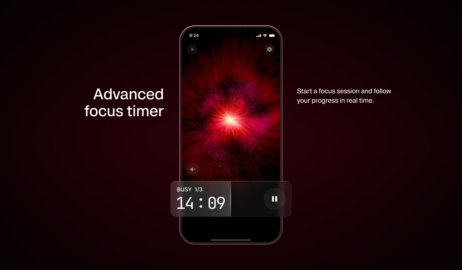
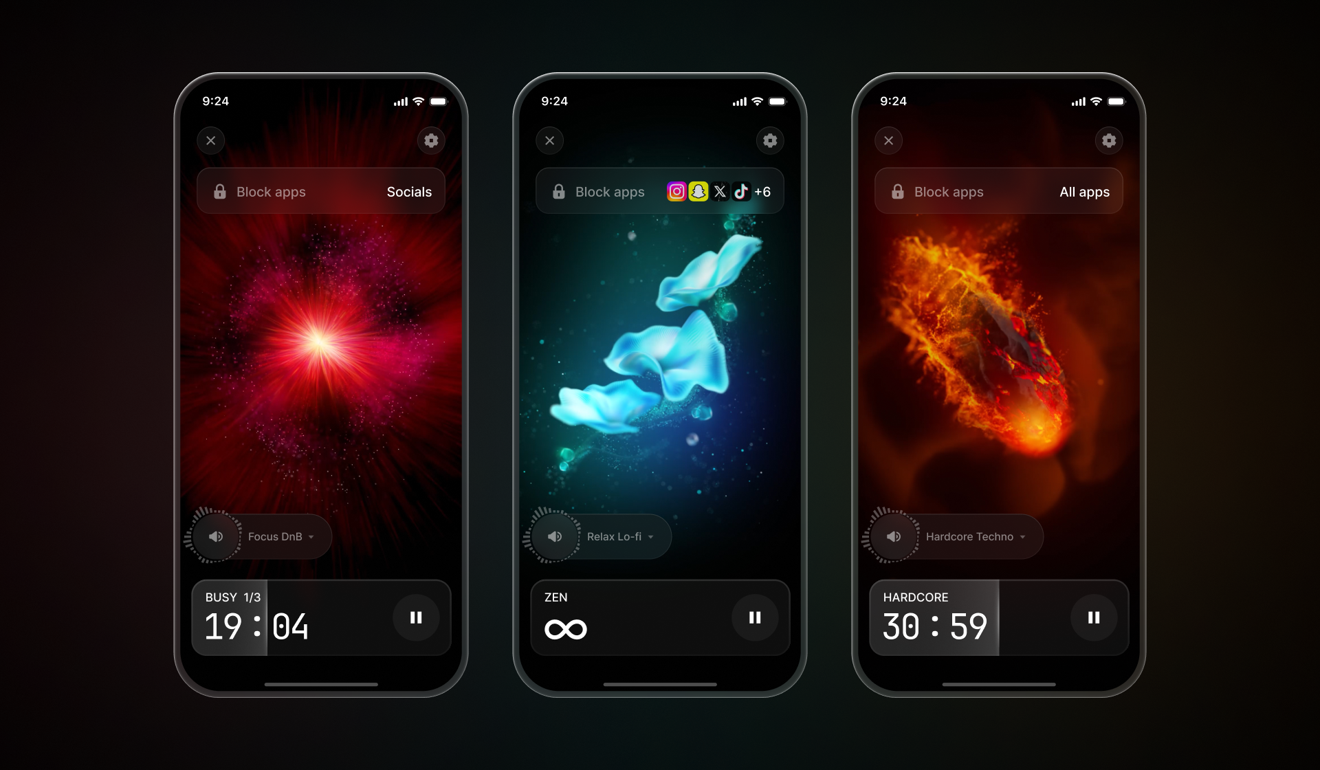
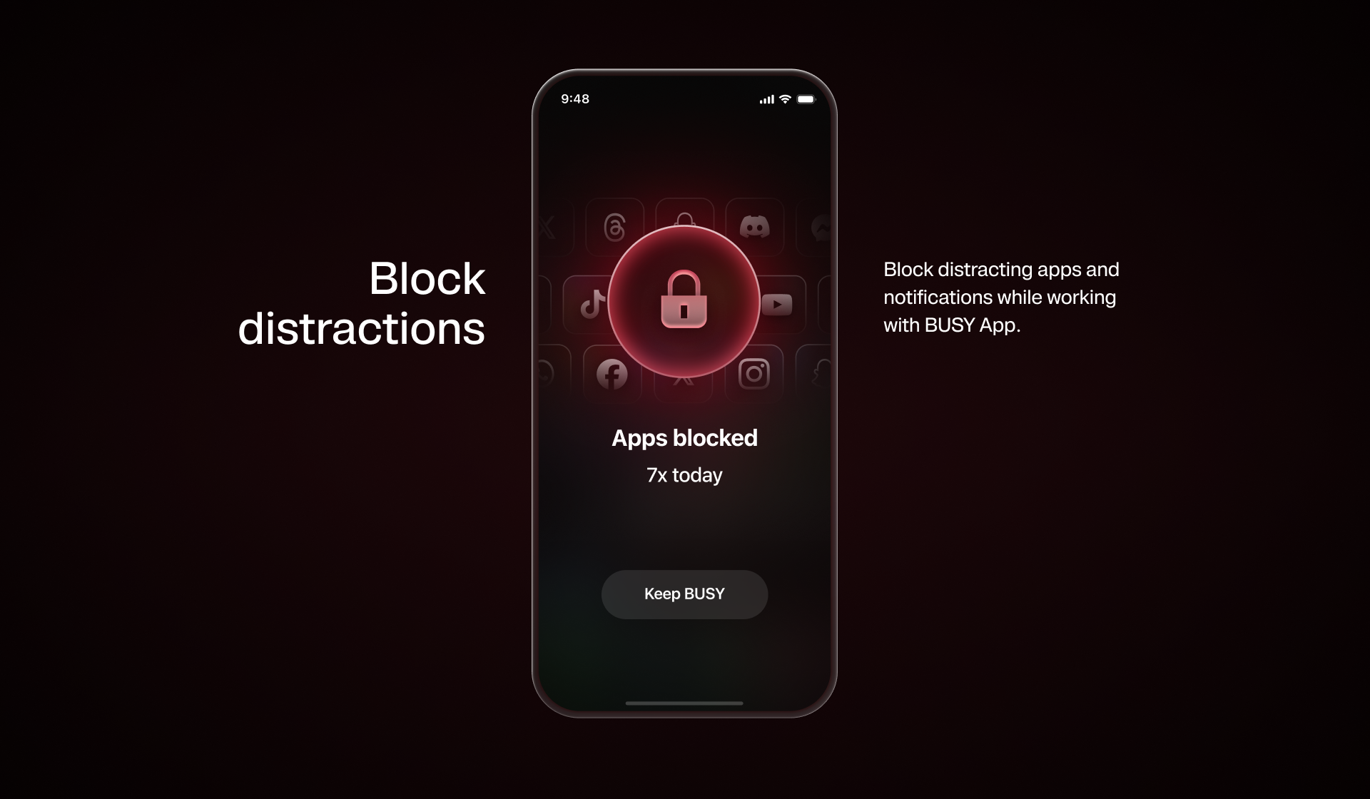
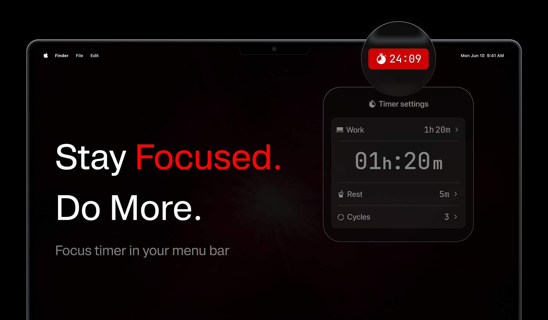
05 – Screenshots
App screenshots
Official app screenshots for product and partner materials. Use as provided. Do not crop, annotate,or alter the interface.
Mobile app/
More on Google Drive


Desktop app/
More on Google Drive
06 – Brand spelling
Brand name
The way we write BUSY is part of the brand. Keep the name consistent across every headline, caption, asset, and partner placement.
Approved spelling
Always write the brand name using the approved spelling:
BUSY — always in ALL CAPS.
Bar — always with the first letter capitalized and the remaining letters lowercase. The correct brand name is BUSY Bar.
App — always with the first letter capitalized and the remaining letters lowercase. The correct brand name is BUSY App.
BUSY Bar — always keep the full name together. Never split
in two lines.
Do not use alternative capitalizations

Busy Bar / Busy App
BUSY BAR / BUSY APP
busy bar / busy app
Busy bar / Busy app
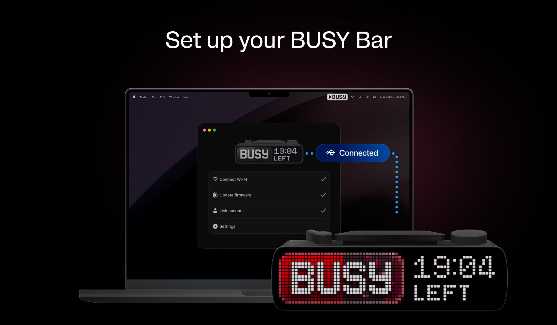
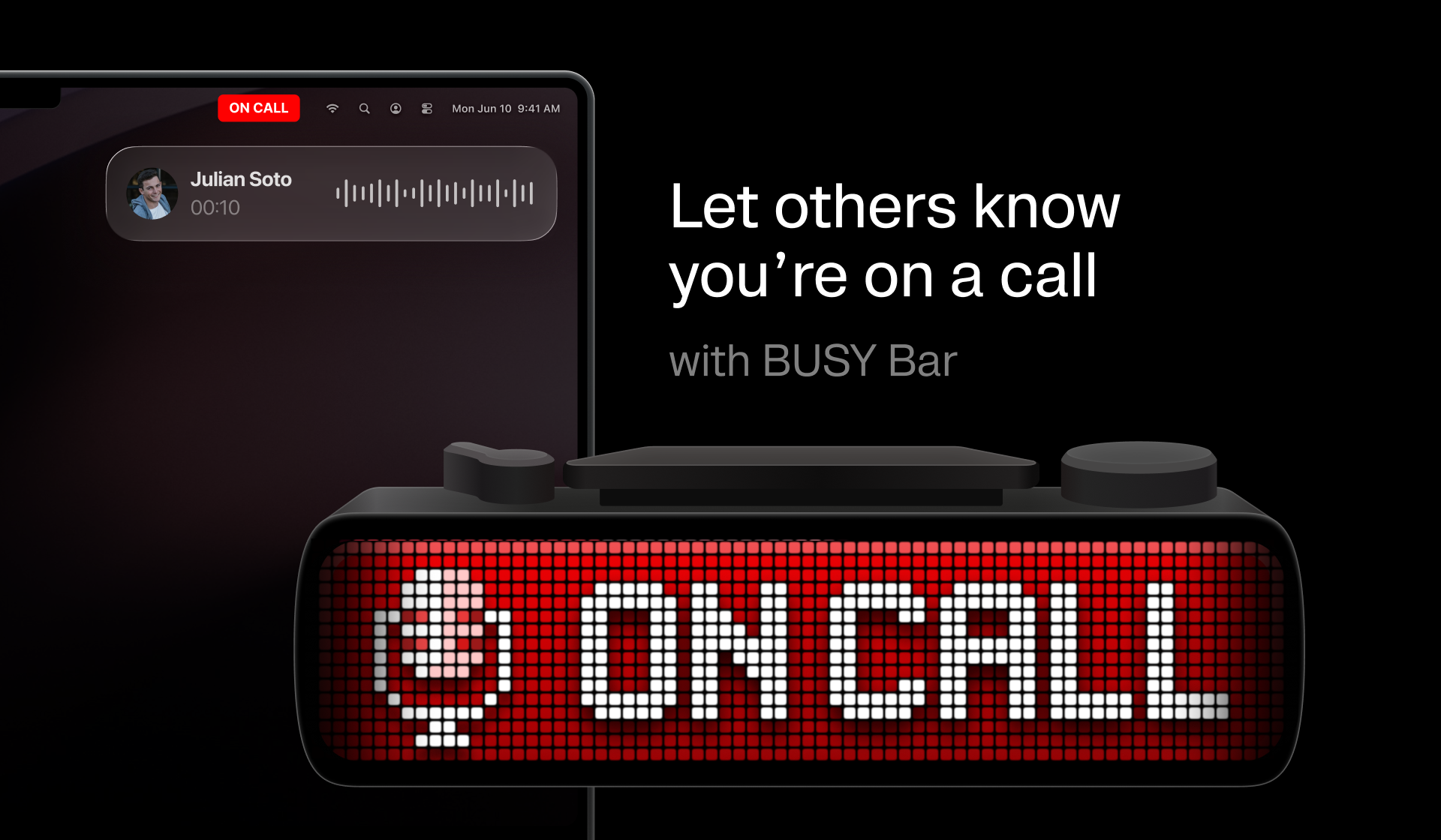
07 – BUSY Bar
What BUSY Bar is and isn't
Help audiences understand what BUSY Bar is — and what it isn't — by presenting it in line with its intended purpose, positioning, and brand identity.
What it is
A physical focus and status device for your desk.
An RGB LED pixel display that shows your status to the room.
A reworked Pomodoro timer with a real cross-device distraction blocker.
Features real mechanical controls — buttons, scroll wheel, mode selector.
An open platform: open API, libraries, open-source firmware.
Paired with the free app for phone, computer, and watch.
What it isn't
Not a decorative LED matrix or a weather/info display.
Not about pixel count — the un-dismissable, in-the-room status is the point.
Not a willpower machine — it signals and protects focus, but it doesn't focus for you.
Not locked down — nothing proprietary you can't script or extend.
Device assets
Approved device renders and illustrations for partner and public-facing materials.
Device solo /
Use by default for clean product-led layouts.
Download PNG
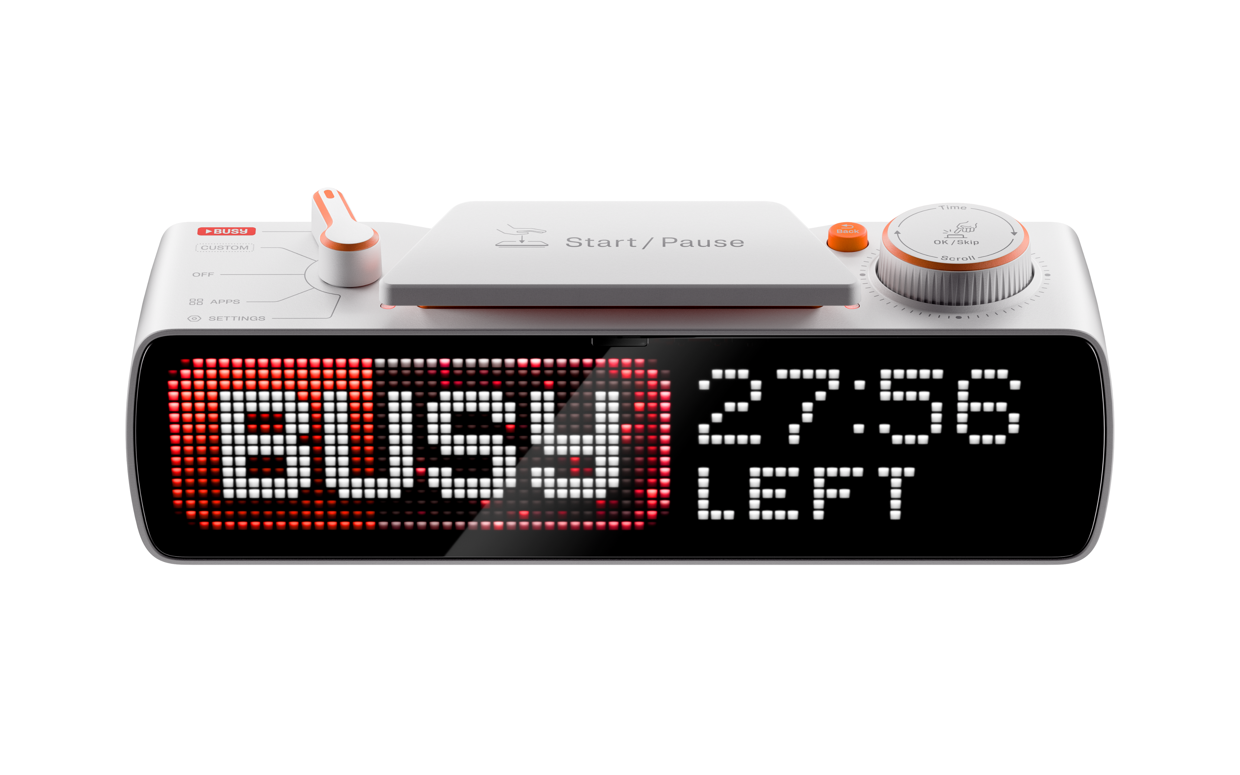
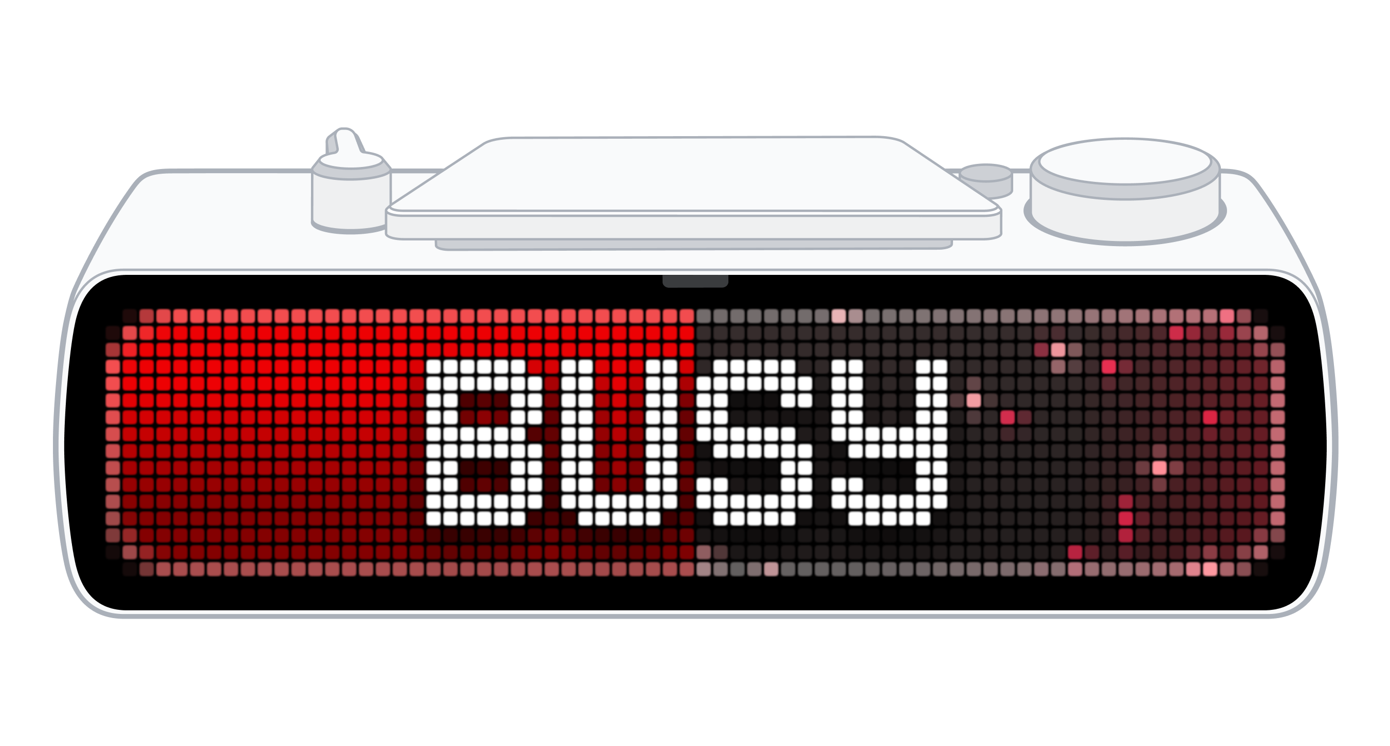
Illustration /
Use for simpler editorial or explanatory layouts.
Download PNG
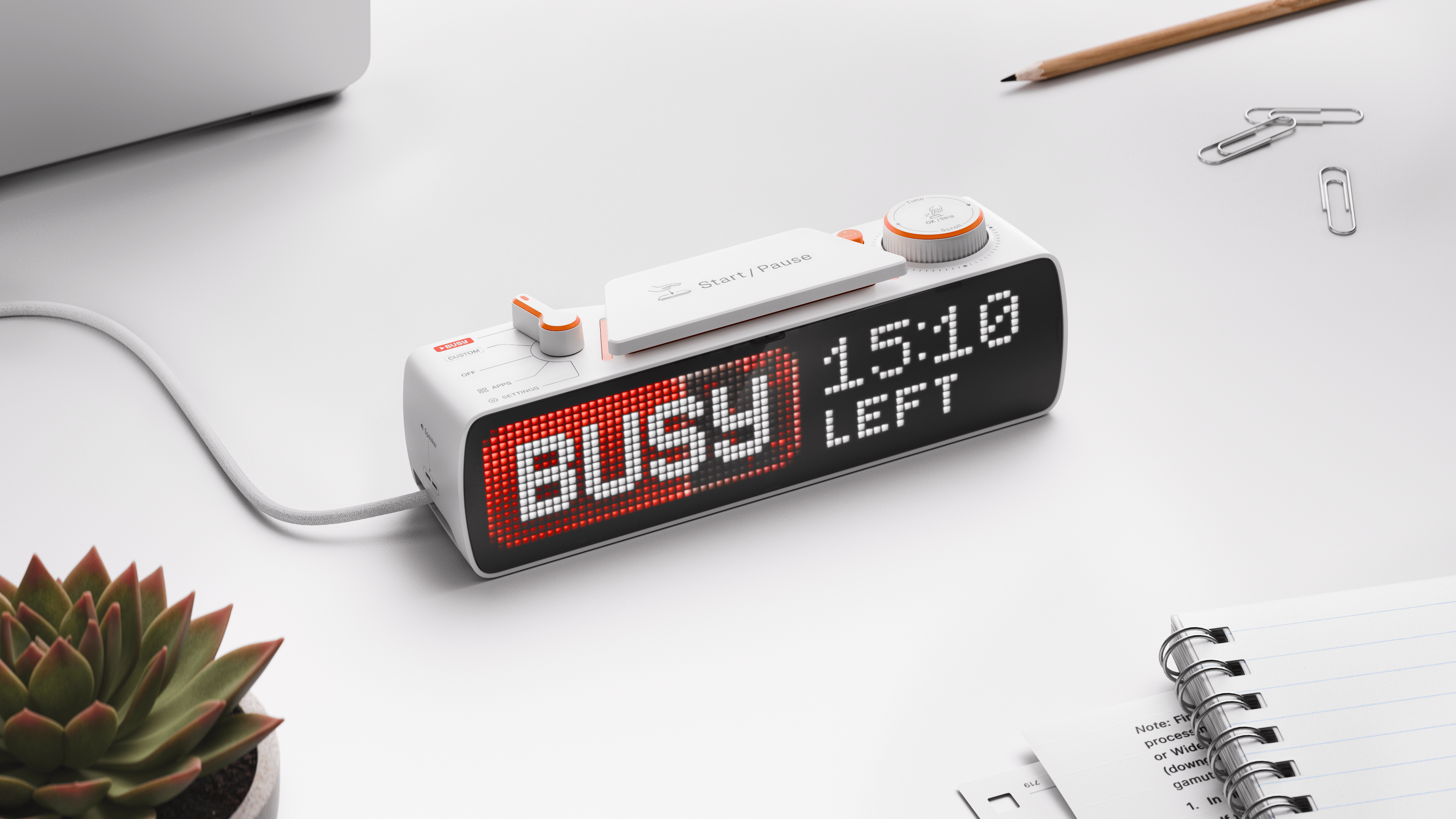
Product media /
Use when showing BUSY Bar in real environments, desks, setups, or lifestyle contexts.
Download PNG
08 – Rules
Do's & Don'ts
Use these rules as a final check before publishing. They define what is allowed, what should be avoided, and when approval is required. Reach out if anything feels unclear.
DO

Use the official files provided in this kit in original format.
Choose the logo version with the strongest contrast.
Maintain clear space around the logo.
Match optical height in co-branded placements.
Write the brand name as “BUSY” — all caps.
Refer to the app as “BUSY App”.
Refer to the device as “BUSY Bar”.
Use approved device renders and illustrations only.
Reach out if you need a variation.
Don't
Place the logo on low-contrast or busy backgrounds.
Stretch, rotate, crop, distort, recolor, or recreate the logo.
Apply shadows, glows, or effects to the logo or any provided files.
Use colors outside the approved system.
Apply filters to any asset.
Write the brand name as Busy, busy, or B U S Y.
Use AI-generated or AI-modified device visuals without approval.
Stretch, warp, redraw, or change the device shape.


